
HELP WOW SURPRISE BUILD AN ONLINE SHOPPING PLATFORM FOR BLIND BOX SHOPPERS VIA WECHAT MINI-PROGRAM.
WOW SURPRISE
E-COMMERCE


Blind boxes-small, sealed packages containing one random collectible toy in a series-are becoming big business in China with young adults jumping onto the novelty bandwagon.
In 2020 during a shopping season, 55,000 blind boxes were sold out in only 9 seconds.
BLIND BOX INDUSTRY ON THE RISE
The Psychology Behind Blind Box
IT’S ALL ABOUT
SURPRISE

People who buy blind boxes enjoy the surprise and uncertainty attached to the idea of opening a mystery box. (The feeling is the same as opening birthday gifts, which is called delayed gratification in psychology.)
Our client-the CEO of WOW SURPRISE joined the blind box business since 2017. Currently, WOW SURPRISE has built thousands of off-line stores.
As the e-commerce for the blind box industry is on the rise, our client sees the opportunity and presents us with a challenge to build an online blind box platform in the form of a WeChat* mini program.
*WeChat is a Chinese multi-purpose messaging, social media, and mobile payment app from Tencent.
User Interview
EVERY COIN HAS TWO SIDES
The surprise is the reason people purchase the product, it can also become the reason they don’t buy the product. When people get what they want, it’s a good surprise, and if not it becomes a disappointment.


People hesitate to make more orders for avoiding the risk of getting the piece they already owned.
With this in mind, we want to focus on encouraging users to continue shopping after the first purchase.
Ideation & Design Process
DESIGN FOR CONFIDENCE
User’s Voice: “when shopping in the store, I can feel the box’s weight, and even shake the box to guess what might be in the box.“
For blind box shoppers, each box is unique. When they are shopping offline, they often spend a long time deciding on which box to purchase.
Unlike shopping offline, users can feel the weight and even shake the box to feel the product, the online shopping experience seems much more distant. How do we transform the awsome offline interactions into online experiences?
How We Did It?
1. Each Box Is Unique
Since the users care about the connections with the blind box they choose, instead of offering them a random box, we decided to let the users pick one themselves.
3. Hint Indicator
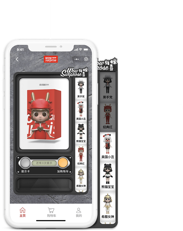

The hints won’t reveal what’s in the box but help eliminate some options. After using a hint, some figures in the right column would turn grey indicating the users that they won’t get any of these figures in the package.
(3 hints left)
2. Have a hint
Instead of adding the item directly to the shopping cart, we added a “hints” function to help the users know more about their choice of the box.
(Add to cart)
(Have a hint)

Users have expressed their concerns regarding the shopping cart after using hints. When applied a hint to an item, they spent time (and money) on that item, so they are expecting their items can be saved after adding to the cart.
However, our clients point out that they couldn’t bear the cost of stocking fees and risk losing other potential sales if they save the items in the shopping cart for users.

Exploring

(Got It)
(Your Cart Expires Soon)
(Check Out Now)
We could set a time limit for saving the cart for users, but how do we make sure the users know about the time limit when adding an item to the cart?
Also, setting a time limit for a shopping cart can also make the users feel being pushed and thus have an unpleasant shopping experience. Thus, we discovered setting a time limit for the shopping carts is not an optimal solution.
Our Solution
Taking Advantage Of The Wechat Payment
Since we are building the WOW SURPRISE e-commerce via WeChat Mini Program, we want to take advantage of the WeChat One-Click Pay for Mini Program. Instead of adding the item to the cart, we encourage our users to check out directly after they’ve made their choice of the box.
Over 800 million people in China are using WeChat to pay on a daily basis. It is trustworthy, convenient, and fast.
All they need to do is one single tap.

Mini Program Payment
Users pay for goods or services in Mini Programs created inside WeChat.
How Did We Solve It In Design?
Feedback & Iteration-Round 1
REIMAGING THE SHOPPING CART

(Pay now)
(Hints, 3 left)
(Add to cart)
1. Prominent “Pay Now” Button
As written above, we want to encourage our users to check out directly, and thus we utilize a bright orange to highlight the “Pay Now” button to make it intuitively obvious. Also, we placed the “Pay Now” button in the thumb zone to ensure that the users feel natural to tab it.


(Pay now)
(Don't show again)
(Got it)
(Shopping cart tips)
2. Reinforcement
If a user adds an item to the cart, the “shopping cart tips” would appear from the top to kindly notify the users that their items could be sold to others, and again we offer them an option to “Pay Now” to ensure they get their wanted items.

Feedback & Iteration-Round 2
SEPARATE ORDERS,
SHIP TOGETHER
Problem with multiple shipments:
One big concern from our clients regarding the “Pay Now” feature is the shipment. If the users placed multiple orders, they might end up receiving several packages that could obviously be packed into one.
If a user uses the “Pay Now” button for a quick check out, and then they want to keep shopping after that, how do we prevent creating multiple and unnecessary shipments?

How did we solve it?
Our Strategy

We want to think out of the box. To solve this problem, we create a unique strategy for our clients. Instead of letting the users pay a shipping fee for each order, we allow the users to ship all their separate orders together after they’re done with their shopping.
By doing so, our users won’t be worrying about paying multiple shipping fees when they use the “Pay Now” feature, and they are also encouraged to purchase more products for making the best of the shipping fee.
How Did We Solve It In Design?


(Shipping Options)
1. Ship It Later Option
To avoid multiple shipments when using the “Pay Now” feature, we provide two shipping options for users before checking out. The users can choose “Ship It Later” if they want to keep shopping for other items. In this way, they could ship all their paid items later together and only need to pay the shipping fee once.

(Paid)
(Shopping cart)
(Unpaid)
2. Time For Shipping
After the users are done with shopping, they could go to the shopping cart and ship all their orders at once. By tabbing on the “Paid” section, the users would be able to select and let us ship their “paid but unshipped orders”.

Feedback & Iteration-Round 3
FINDING A BETTER PLACE FOR PAID BUT UNSHIPPED ORDERS
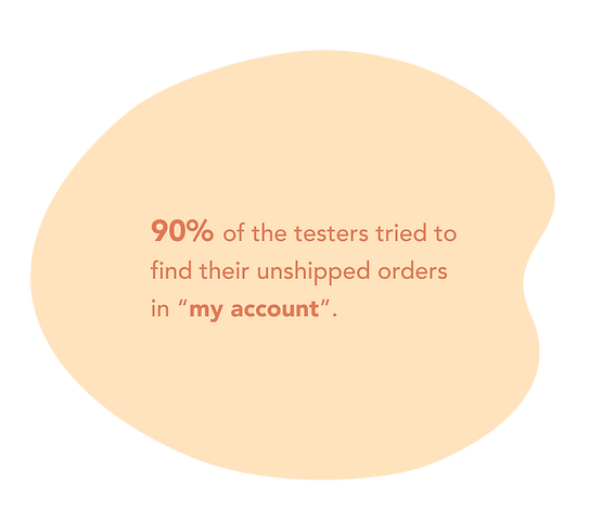
Originally, we placed the “paid but unshipped orders” in the “shopping cart” instead of in “my account” for the reason that we want our users to be able to find the “paid but unshipped orders” easily.
However, in the usability test, we discover that most of the testers have trouble finding their “unshipped orders” since people intuitively think the orders (no matter shipped or unshipped) should go into “my account”.
Exploring solutions
Problem With “My Account”
If we place the “unshipped” orders in “my account”, there is one problem we need to solve:
Now there are many other pieces of information that need to be included in “my account”. How are we going to arrange and group the information in “my account” to make sure that our users are able to find their “unshipped orders” easily?

How Did We Solve It In Design?


Using a dark background to make light contents stand out.
Center-aligning the features that are most likely to be frequently used. Compare to other contents that are all aligned to the left, the center-aligned contents would draw more attention.
Both “my account” and “unshipped orders” are marked with the red circles to guide users to find their unshipped orders more easily.
Running Forward & Looking Back
Running Forward:
Not long after we present our design to our clients, we are so excited to know that they have already started to build their product based on our designs, and soon the app will be launched on the WeChat Mini program.
Looking Back:
Designing a product for a relatively unfamiliar user type is both a challenging and exciting experience as it provides me a chance to appreciate the importance of user researches. I've taught to think out of the box and try to come up with the solutions in different ways.
Also, since we are building unique features, iteration becomes a very crucial part of the designing process. Through multiple iterations, we eventually create a product with unique features that resolve our users' needs.
Last but not least, I’ve taught to find a balance between the users’ needs, business goals, and technical limitations. Having this great opportunity allowed me to give and receive valuable feedback from not only designers but also the product manager and developers. Through this experience, I gained a deeper knowledge of designing a product with other product stakeholders.
